
어쨌든, 삶은 아름답다
티스토리 반응형 스킨 #2 글 리스트 (글 목록) 폰트 편집하기 본문
아니 무슨 ... 티스토리 반응형 스킨 #2는 폰트 변경을 해도 해도 끝나지가 않는 거지.
모지. 왜지.

여기서 말하는 글 리스트, 그러니까 글 목록이란.
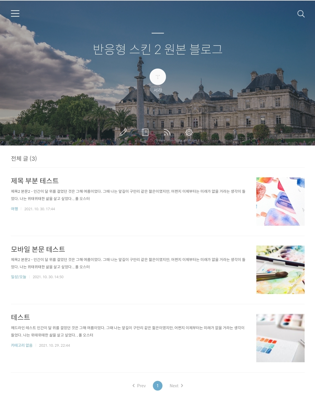
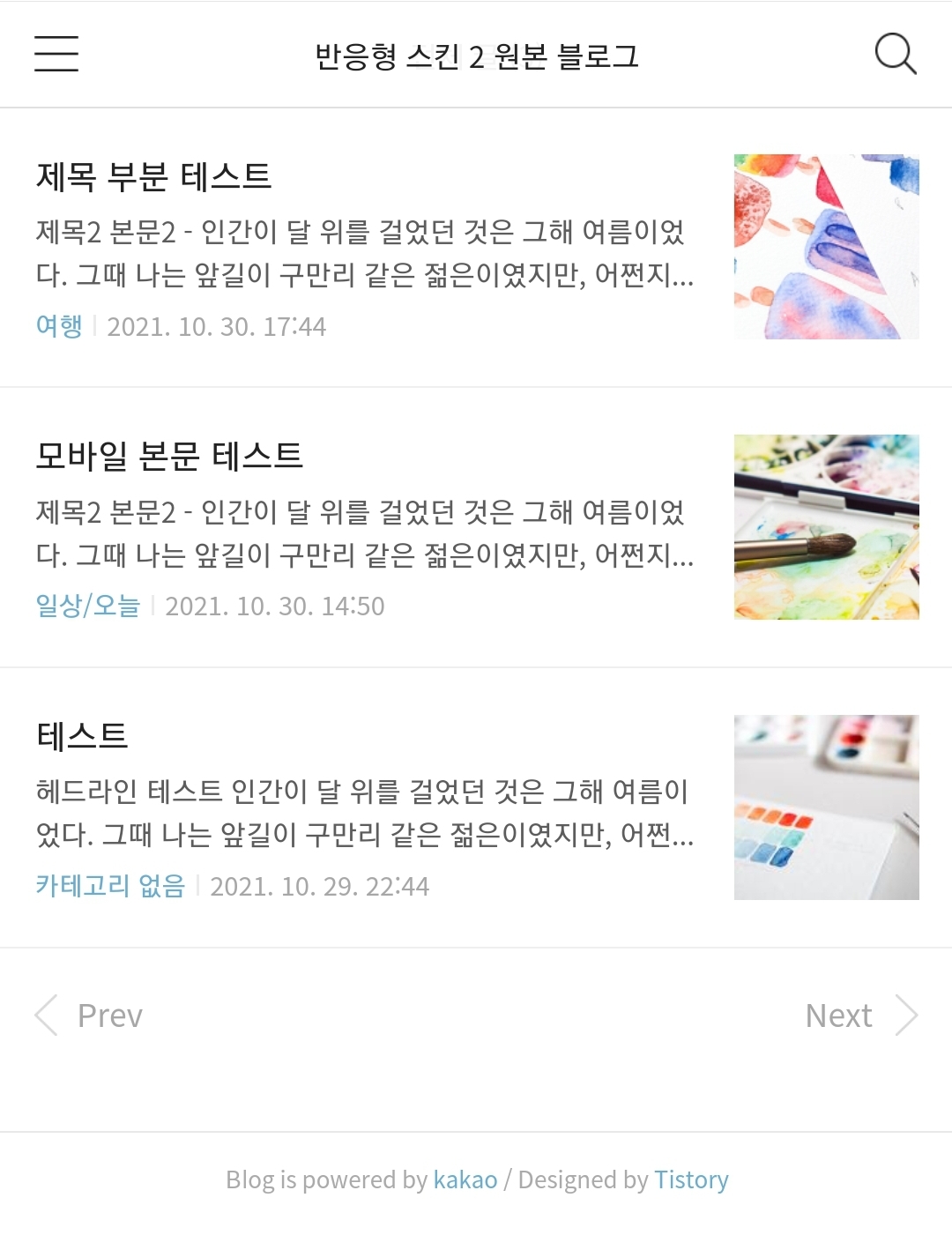
pc모드까지 스샷찍기는 귀찮으니 태블릿pc 모드랑 모바일 모드만 찍었다.
여하튼 내가 말하는 글 목록이라는 것은 이 부분이다. 열심히 쓴 글들이 주루룩 늘어지는 곳.
이쪽 폰트와 레이아웃을 좀 건들여서 예쁘게 만들고 싶다는 집념 하에 나는 또 열심히 삽질을 했다.
pc와 태블릿pc 모드에서의 글 목록 폰트 변경은 매우 쉽다.
둘은 같이 한데 묶어서 보면 된다.
css에서 body,th,td,input,select,textarea,button로 시작하는 부분을 찾자. 상단에 있어서 찾기가 쉽다.
body,th,td,input,select,textarea,button {font-size:14px;line-height:1.5;font-family: '넣고 싶은 폰트 이름', sans-serif;color:#666}
이 코드의 경우는 하단의 포스팅에서도 거론했던 부분이다.
티스토리 반응형 스킨 #2 폰트 변경의 모든 것, PC와 모바일 전부 폰트 변경하는 법!
반응형 스킨 #2만 그런걸까? 아무리 구글링으로 찾아 티스토리 폰트를 바꿔도 새 폰트가 pc 환경에만 적용이 될 뿐 모바일 환경에는 적용이 되지를 않는다. 내가 정작 바꾸고 싶은 폰트는 pc가 아
limen.tistory.com
저 코드 부분을 건드는 것 만으로 전체 글 목록 뿐만 아니라 본문 내의 폰트가 싹 변경이 된다. 물론 모바일 빼고 ㅎ
게다가 모바일 글 목록에 폰트 변경이 적용이 되지 않는 것 외에도, 이 쪽 코드만으로는 글 목록 쪽 수정을 하는데 한계가 명확하다.
일단 글 목록의 텍스트들의 사이즈를 변경할 수가 없다.
글 목록의 텍스트들을 세세히 수정해보자.
/* 헤더 */ 라는 주석이 붙은 곳의 코드들을 건들이면 된다.
헤더 주석 내부 코드 중에서도 .article_skin .tit_skin으로 시작하는 부분을 찾자.
.article_skin .tit_skin{padding-bottom:15px;border-bottom:1px solid #efefef;font-weight:normal;font-size:20px;line-height:26px;color:#5c5c5c}
이 부분은 pc/태블릿pc 모드에서의 글 목록들 맨 위, '전체 글(숫자)' 라는 텍스트 부분을 수정할 수 있다.
텍스트 뿐만 아니라 '전체 글(숫자)' 아래의 얇은 줄을 수정할 수도 있는 부분이기도 해서 줄 관련해서 추가 설명도 덧붙인다.
padding-bottom:15px 아래 줄과의 간격
border-bottom:1px 줄 두께
solid 줄 타입
#efefef 줄 색상
참고로 padding-top 값을 넣으면 커버 이미지와의 간격도 띄울 수 있다.
폰트 관련 추가 설명은
font-weight:normal; 폰트 두께
font-size:20px; 폰트 사이즈
line-height:26px; 글줄 두께
color:#5c5c5c 색상
따로 '전체 글(숫자)'에 폰트를 지정해주고 싶다면 { } 속에 font-family: '넣을 폰트이름'을 넣어주면 된다. 항상 뭔가 추가로 집어넣을 때 세미콜론(;) 잊지 말길.
자, 여기서 끝이 아니다.
이제부터 본격적으로 '전체 글(숫자)' 아래, 글 목록 부분을 수정해보자.
css를 보면 /* 리스트 */ 로 이미 주석처리가 된 부분이 있다.
리스트 주석은 두 군데가 있는데, 그 중 맨 처음 등장하는 리스트 주석 부분을 통으로 뜯어왔다.
/* 리스트 */
.list_content {padding:24px 0 26px;border-bottom:1px solid #efefef }
.list_content::after { content:''; clear:both; display:block }
.list_content .thumbnail_post { float:right; width:150px; height:150px; margin:6px 0 5px 30px }
.list_content .link_post{display:block;overflow:hidden;text-decoration:none}
.list_content .link_post:hover .tit_post {color:#6bacce}
.list_content .tit_post{display:block;font-weight:normal;font-size:24px;line-height:34px}
.list_content .txt_post{display:-webkit-box;display:-ms-flexbox;display:box;overflow:hidden;margin-top:4px;font-size:13px;line-height:23px;color:#5c5c5c;vertical-align:top;word-break:break-all;-webkit-box-orient:vertical;-webkit-line-clamp:4}
.list_content .txt_bar { margin:0 7px }
.list_content .detail_info{margin-top:11px;font-size:12px;color:#aaa}
.list_content .detail_info .link_cate{font-size:13px;text-decoration:none;color:#6bacce}
저 코드들이 원본이 아마 ... 맞을 것이다. 아마도?
떼놓고 설명하는 것보다는 코드 옆에 주석을 달아서 한 번에 설명을 하는 게 좋을 것 같다.
특수한 경우를 제외하면 아래 코드는 pc/모바일 모드에서만 적용이 된다고 보면 된다.
/* 리스트 */
.list_content {padding:24px 0 26px;border-bottom:1px solid #efefef }
.list_content::after { content:''; clear:both; display:block }
/* margin값을 건들면 썸네일과 글 목록 사이 간격 조정 가능 */
.list_content .thumbnail_post { float:right; width:150px; height:150px; margin:6px 0 5px 30px }
.list_content
/* { } 사이에 폰트 삽입시 글 제목과 요약글의 폰트가 함께 변경 */
.link_post{display:block;overflow:hidden;text-decoration:none}
/* 글 제목에 마우스 오버 시 변경되는 색상 변경 (모바일의 경우, 터치 이후 남은 흔적 색상) */
.list_content .link_post:hover .tit_post {color:#6bacce}
/* 글 제목 사이즈 변경, 요약글과의 간격 조정, 폰트 삽입 시 글 제목만 폰트 변경 */
.list_content .tit_post{display:block;font-weight:normal;font-size:24px;line-height:34px}
/* 요약글 사이즈 변경, 요약글 줄 수 변경, 폰트 삽입 시 요약글만 폰트 변경 가능, 글 제목과 요약글 사이 간격 조정 가능(이 경우 모바일에도 약간의 영향을 줌) */
.list_content .txt_post{display:-webkit-box;display:-ms-flexbox;display:box;overflow:hidden;margin-top:4px;font-size:13px;line-height:23px;color:#5c5c5c;vertical-align:top;word-break:break-all;-webkit-box-orient:vertical;-webkit-line-clamp:4}
/* 카테고리와 작성일 사이의 간격 조정 */
.list_content .txt_bar { margin:0 7px }
/* 요약글과 카테고리-작성일 줄간격 조정, 카테고리-작성일 폰트 변경 가능, 사이즈와 색상은 작성일에만 영향을 줌 */
.list_content .detail_info{margin-top:11px;font-size:12px;color:#aaa}
/* 카테고리 파란색 폰트, 색상, 사이즈 변경 (pc와 모바일 전부 적용) */
.list_content .detail_info .link_cate{font-size:13px;text-decoration:none;color:#6bacce}
글로 이해가 안 된다면 이해하려 하지 말고 직접 하나씩 해보면 된다. 간단간단.
이제 모바일 쪽 글 목록을 바꿔보자.
리스트를 검색했을 때, 두번째 검색되는 쪽으로 가자.
/* 리스트 */
.list_content {padding:19px 15px 15px}
.list_content .thumbnail_post { margin-top:1px; margin-left:14px }
.list_content .thumbnail_post,
.list_content .thumbnail_post img { width:80px; height:80px }
.list_content .tit_post {font-size:17px;line-height:21px;color:#222;font-family:applesdgothicneo-light;display: -webkit-box;-webkit-line-clamp:2;overflow:hidden;text-overflow:ellipsis;word-break:break-all;-webkit-box-orient:vertical}
.list_content .txt_post {font-size:14px;line-height:19px;font-family:applesdgothicneo-ultralight;-webkit-line-clamp:2;}
.list_content .detail_info {color:#a7a7a7; font-family:applesdgothicneo-ultralight; margin-top:4px}
.list_content .detail_info .txt_bar { margin:0 2px }
.list_content .detail_info .txt_date { font-size:13px }
아마 ... 이번에도 저게 원본 코드가 맞을 것이다.
다시 건들여보자!
/* 리스트 */
/* 글 목록 간격 조정 가능 */
.list_content {padding:19px 15px 15px}
.list_content .thumbnail_post { margin-top:1px; margin-left:14px }
.list_content .thumbnail_post,
.list_content .thumbnail_post img { width:80px; height:80px }
/* 글 제목 폰트 종류, 사이즈 등등 */
.list_content .tit_post {font-size:17px;line-height:21px;color:#222;font-family:applesdgothicneo-light;display: -webkit-box;-webkit-line-clamp:2;overflow:hidden;text-overflow:ellipsis;word-break:break-all;-webkit-box-orient:vertical}
/* 글 요약글 폰트 종류, 사이즈 등등 */
.list_content .txt_post {font-size:14px;line-height:19px;font-family:applesdgothicneo-ultralight;-webkit-line-clamp:2;}
/* 카테고리랑 작성일 폰트 변경 가능, 색상 변경은 작성일만 가능 */
.list_content .detail_info {color:#a7a7a7; font-family:applesdgothicneo-ultralight; margin-top:4px}
/* 카테고리와 작성일 사이의 간격 조정 */
.list_content .detail_info .txt_bar { margin:0 2px }
/* 작성일 사이즈 변경 가능 */
.list_content .detail_info .txt_date { font-size:13px }
역시나 이해가 잘 안 된다면 이해하려 하지 말고 직접 하나씩 해보길! 직접 해봐야 느낌이 빡 온다.
뭐 ... 별 수 없듬.

이런 저런 삽질로 현재 꾸려낸 현재 내 티스토리 반응형 스킨 #2의 상태는 이렇다.
커버 사진을 모드마다 다르게 적용하는 방법도 포스팅 할 예정이다.
다만 지금 모바일 모드에 커버 사진 낑겨넣는 삽질이 아직 끝나지 않아서 언제 포스팅을 올리게 될 지는 모르겠다.
아무튼 추가적으로 글 목록을 수정할 때, 아래 포스팅을 보면 도움이 될 것이다.
- 글 목록 사이의 줄 제거법
티스토리 반응형 스킨 #2 글 리스트(글 목록) 사이의 줄을 제거하는 방법
요즘 티스토리 스킨 수정에 꽂혔다. 사실 정작 바꾸고 싶은 건, 모바일 상태에서도 헤더인지 타이틀인지 뭔지 거기에 이미지를 예쁘게 띄우는 건데 ... 아직 허접이라 방법을 못 찾고 (._. ... 티스
limen.tistory.com
- 글 목록 본문 요약 줄 수 줄이는 법
티스토리 반응형 스킨 #2 글 리스트(글 목록) 본문 요약 줄 수 줄이기
본문 요약글이 너무 길다. 글이 모여있는 리스트에서 가장 중요한 건 글, 그러니까 포스팅의 제목이 아닐까? 제목 아래 길게 늘어진 본문의 요약글이 아니라. 그런데 대체 왜 티스토리의 글 목록
limen.tistory.com
화이팅.
'팁글 > 티스토리' 카테고리의 다른 글
| 티스토리 반응형 스킨#2 카테고리에 글 개수 표시하는 방법 (1) | 2021.11.03 |
|---|---|
| 티스토리 글 작성 날짜 표시 형식을 미국식으로 바꾸는 방법 (1) | 2021.11.01 |
| 티스토리 반응형 스킨 #2 카테고리(사이드바 포함)의 폰트와 폰트 색상 변경하기 (0) | 2021.10.30 |
| 티스토리 반응형 스킨 #2 폰트 변경의 모든 것, PC와 모바일 전부 폰트 변경하는 법! (12) | 2021.10.30 |
| 티스토리 반응형 스킨 #2 글 리스트(글 목록) 본문 요약 줄 수 줄이기 (1) | 2021.10.29 |


